The Evolution of Wayfinding
We’re a long way from a completely tech-driven wayfinding…
Feb. 6, 2014, Healthcare Design
In less than three years, the technological age of mobile wayfinding is here.
Entering an unfamiliar environment under stress, visitors face navigating and often times sprawling hospital system similar in size to a shopping mall or major airport. Anxious first time visitors looking to reach their destination may be expected to interpret unfamiliar medical terminology, avoid construction closures, or find satellite locations. The complex mix of services hospitals offer – inpatient, outpatient, diagnostic and treatment – along with the configuration and size make hospitals especially daunting to navigate.
Hospital visits are already fraught with anxiety, and with reducing stress as the goal in mind, how can hospital visitors move from one point to the next most effectively and safely?
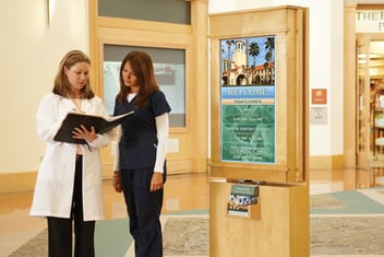
Forward thinking healthcare systems deliver a positive emotional experience through patient engagement. The evolution from physical signage to digital signage and on to mobile wayfinding has revolutionized hospital navigation and improved the patient experience through providing real-time, seamless guidance to visitors. Mobile wayfinding acts as your personalized assistant guiding you to and within the entire healthcare system.
Mobile wayfinding also overcomes the limitations of physical signage and digital signage that requires the right combination of fonts, color, icons, logos, placement, size, and plain language terminology without being cluttered or confusing. Plus, all of these factors must be standardized throughout the hospital in order to produce a continuous chain of physical navigational cues. Static hospital signage moves patients and visitors from one cue to the next, so adding any more directional information can overwhelm and confuse visitors.
Physical signs depend, of course, on you reaching the hospital in the first place. In contrast, mobile navigation begins with the user’s current location instead of starting at the hospital’s lobby doors. Blue dot guidance takes the visitor to her healthcare destination without having to decipher signs and symbols along the way. Mobile wayfinding takes the guesswork out of choosing the best route. Unlike with physical signage where visitors move from sign to sign, visitors can anticipate their entire journey to their destination.
We’ve come a long way from the days of being greeted at the hospital doors with only color coded signs and directional arrows.


